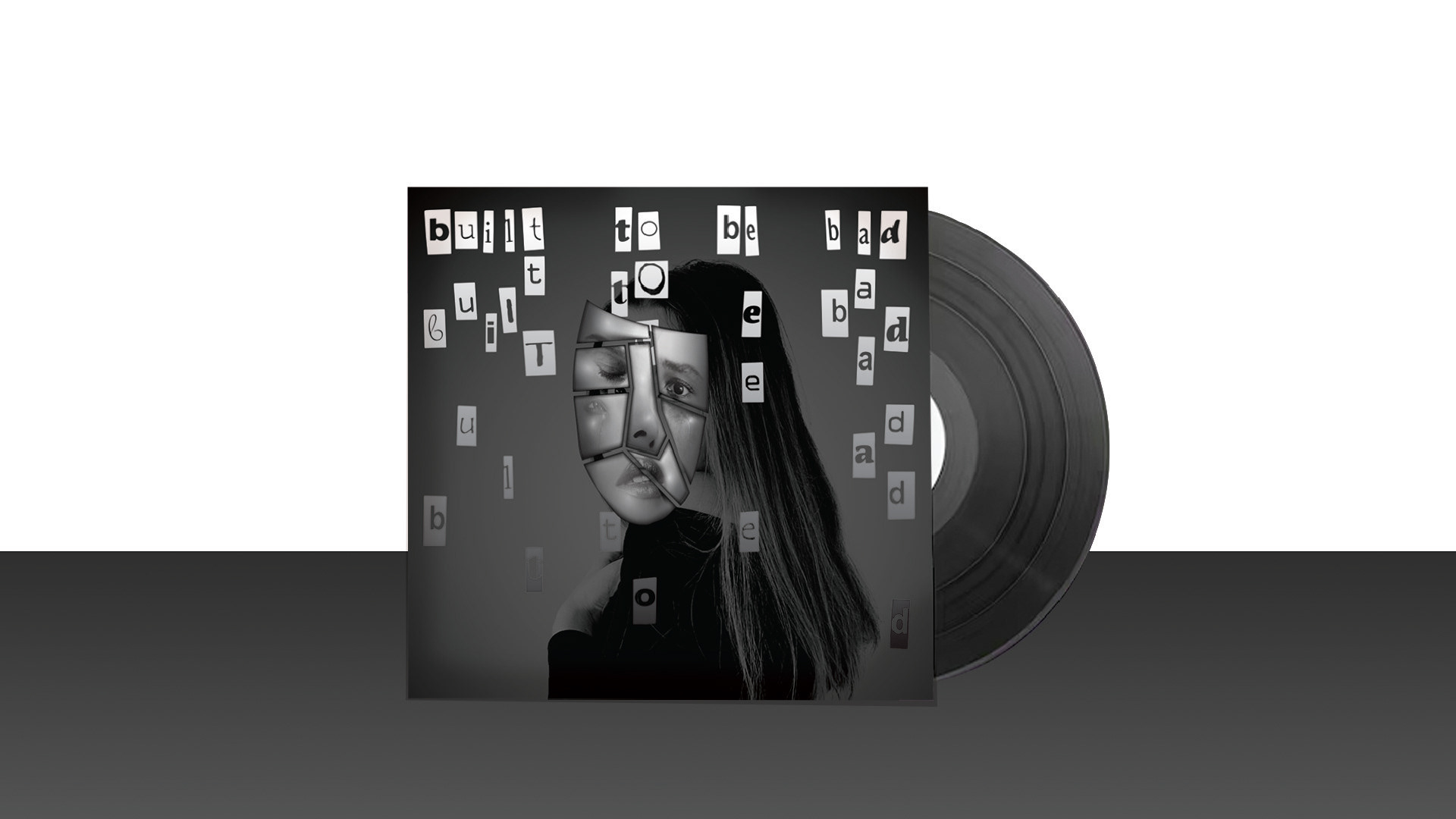
Redesigning book covers
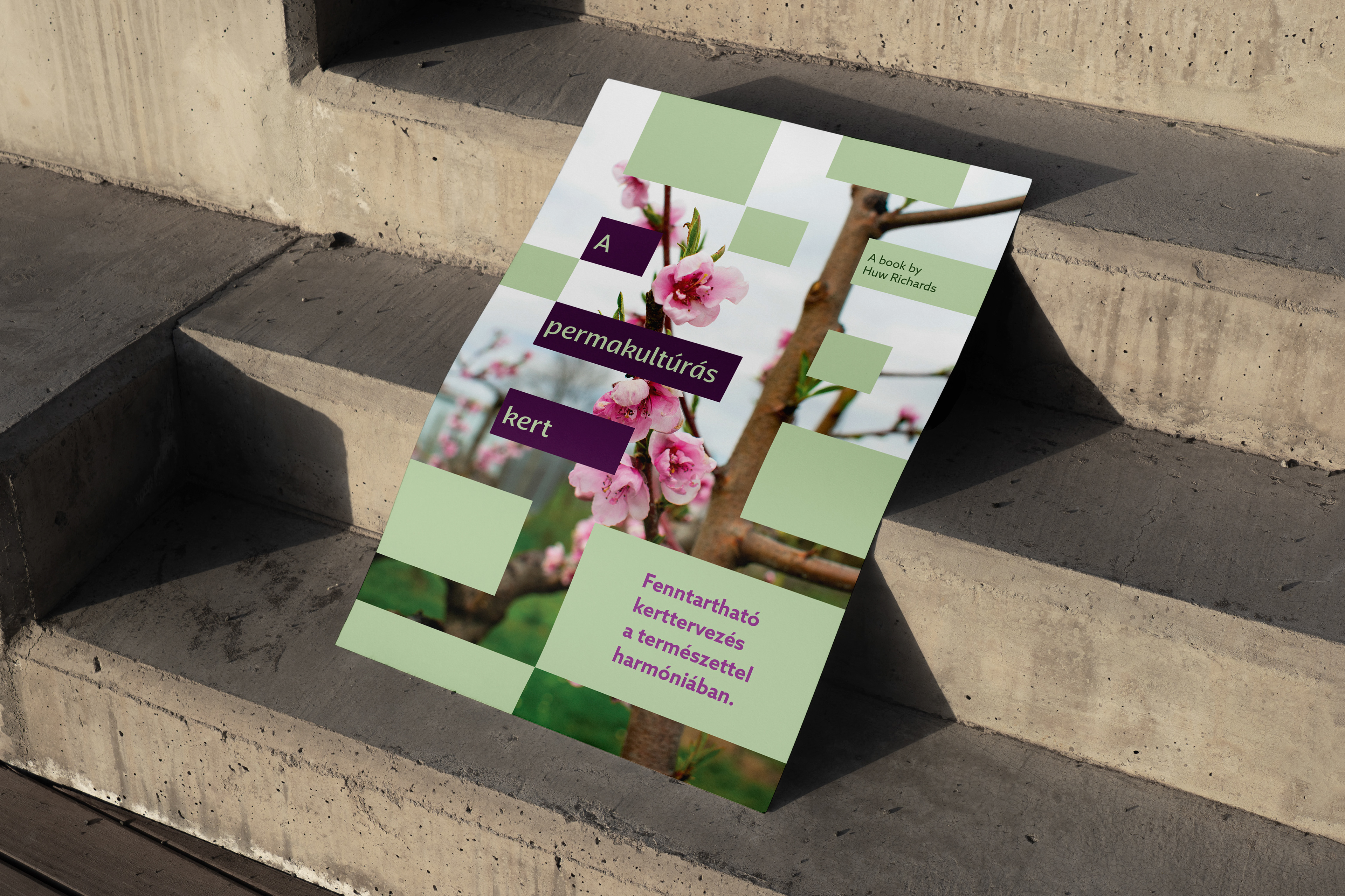
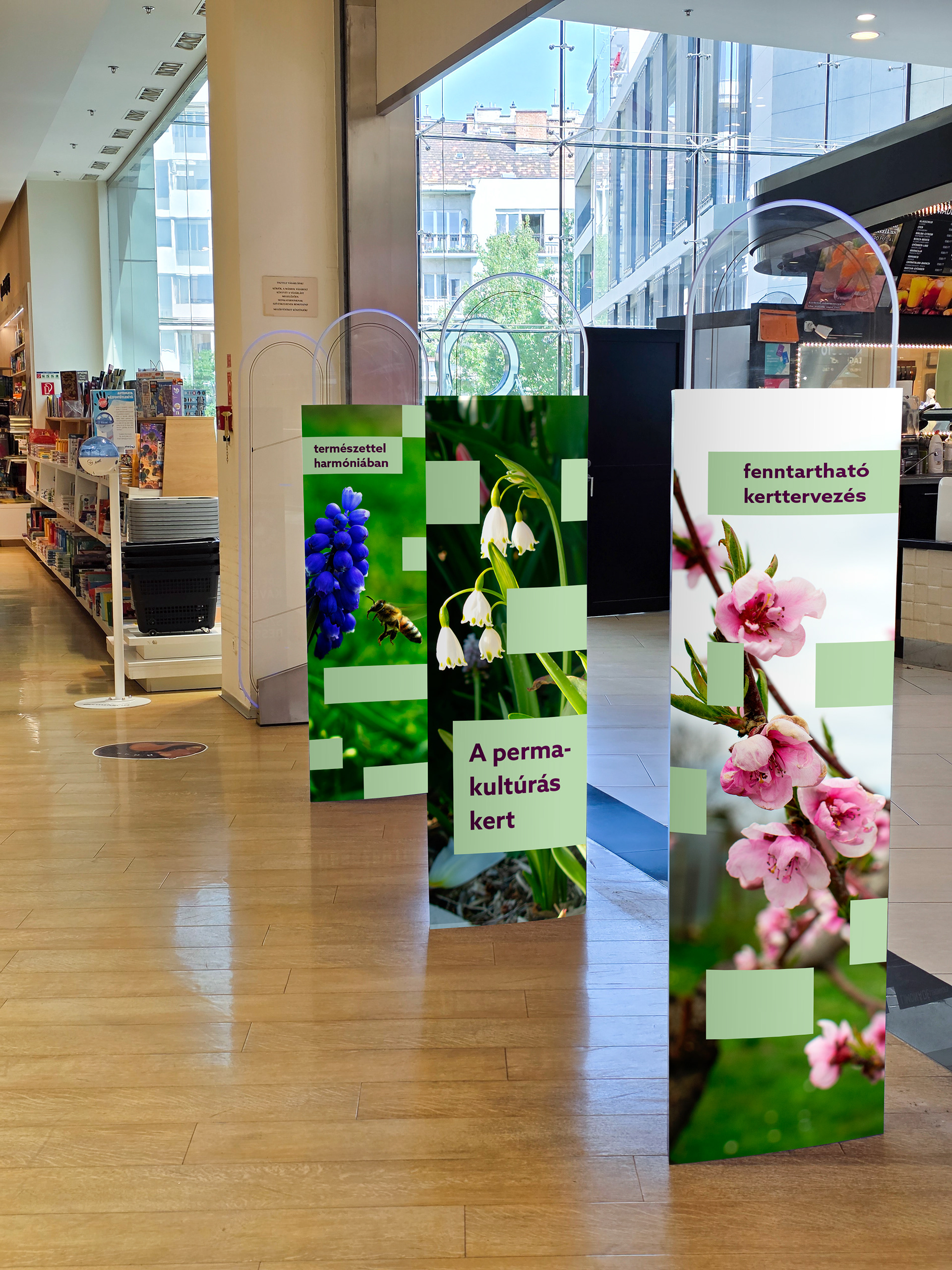
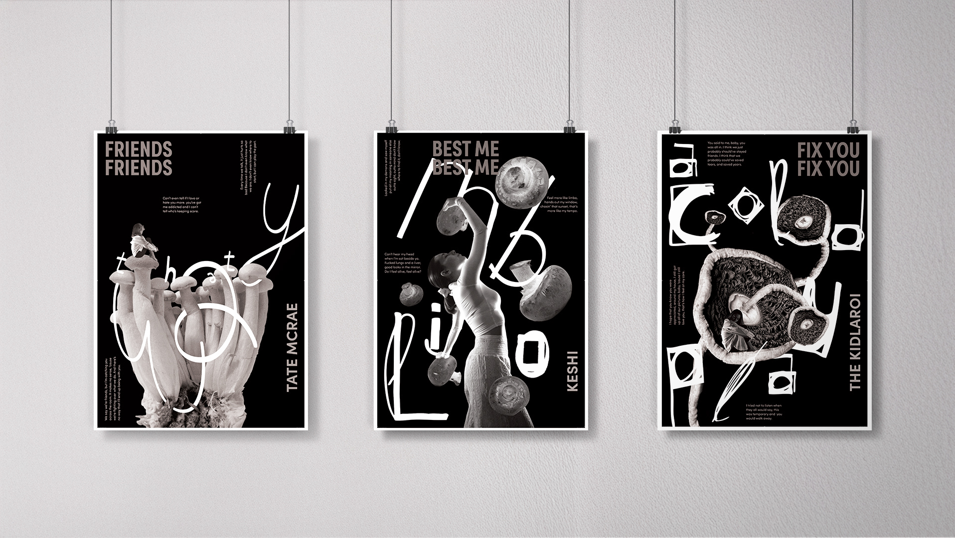
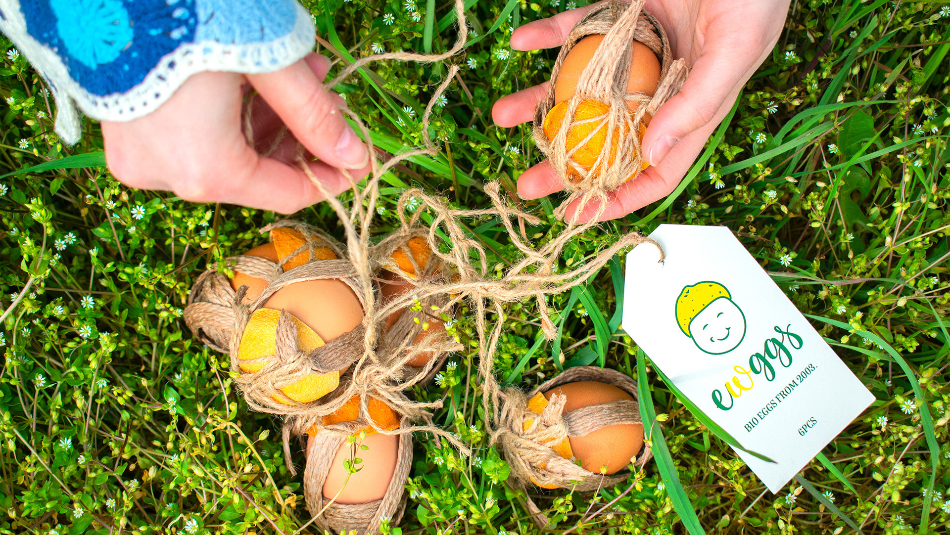
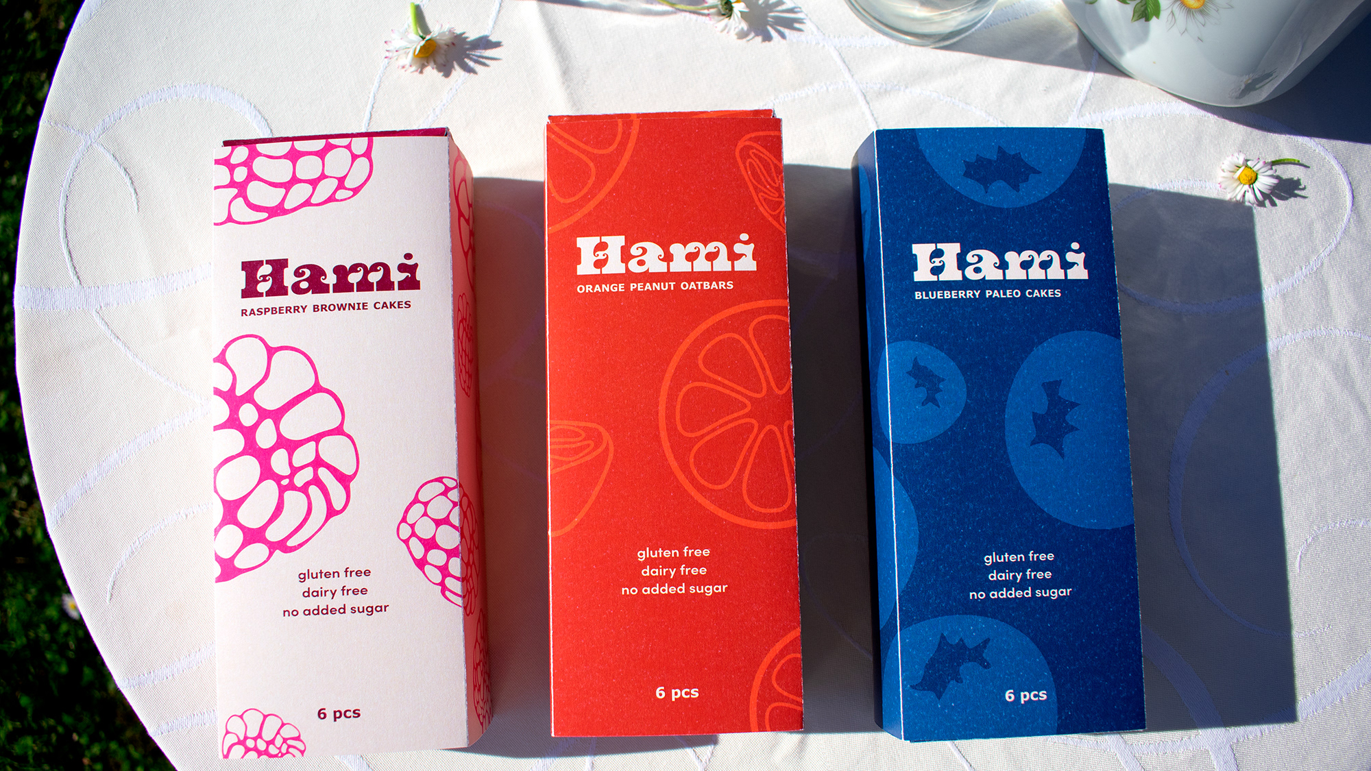
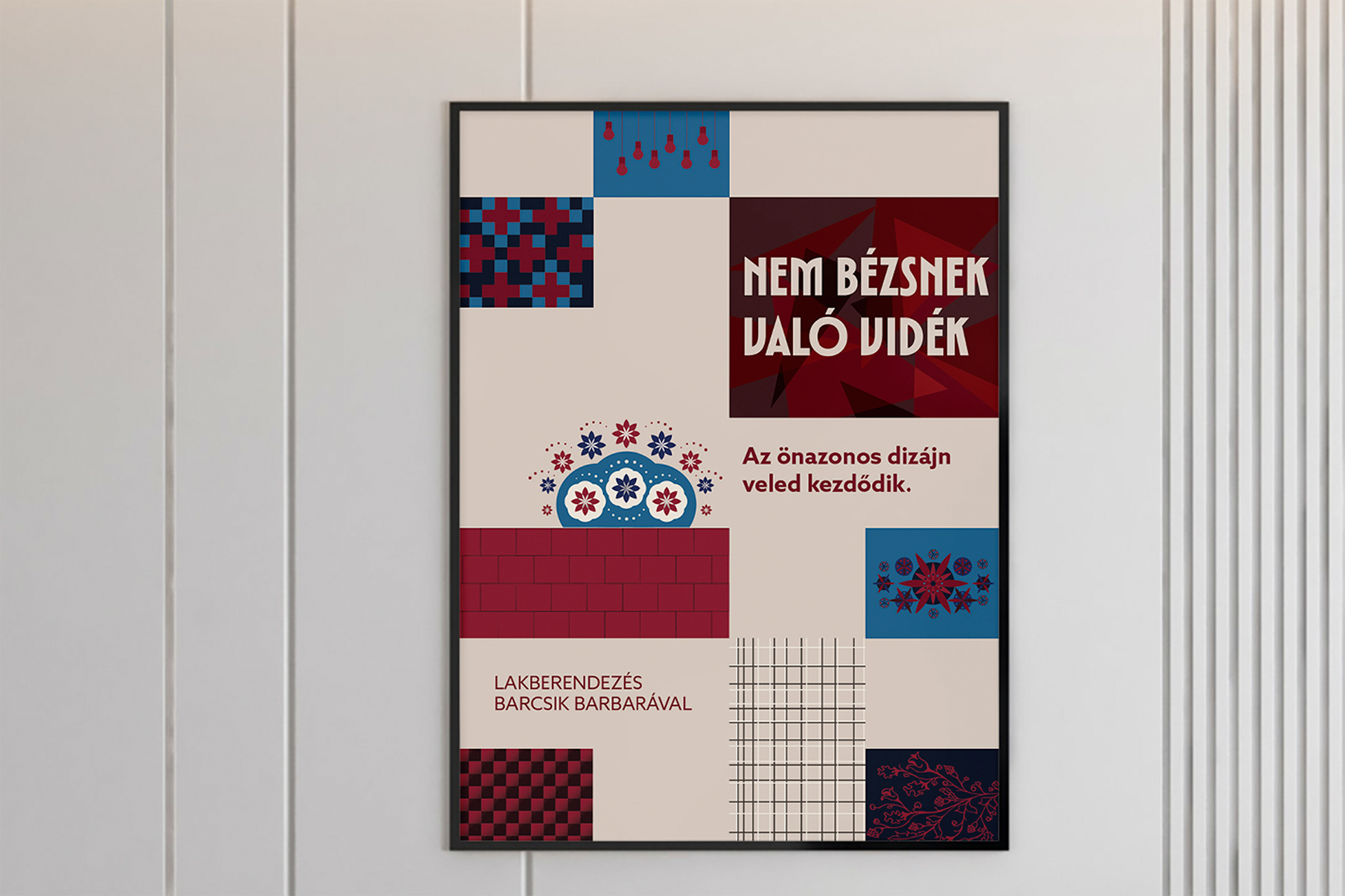
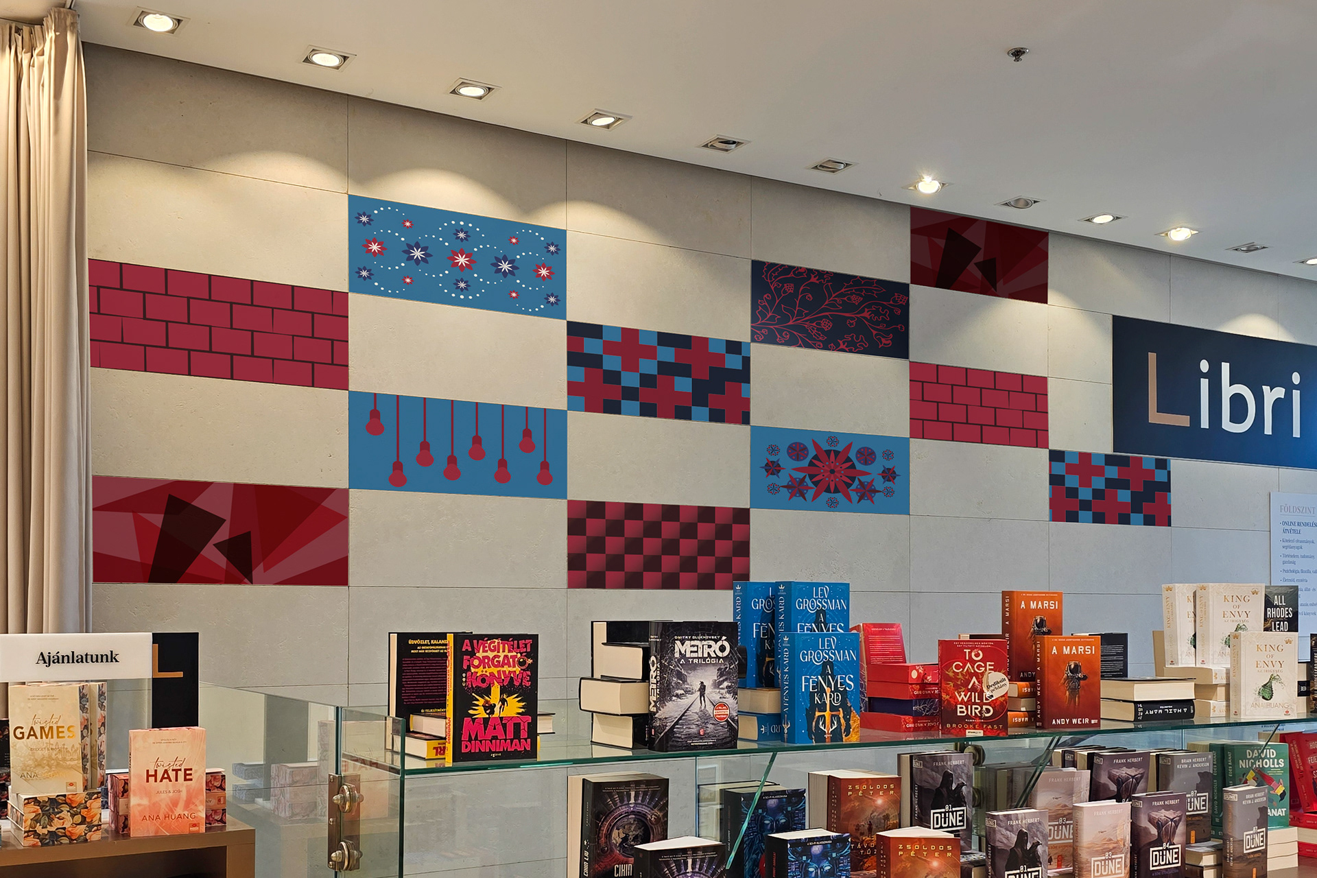
This project concentrates on the flexibility of visual elements. From book covers, through poster designs until in store designs. How to keep the same style while adopting it to another surfaces.
1. Nem bézsnek való vidék
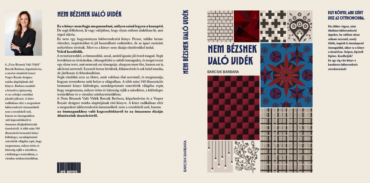
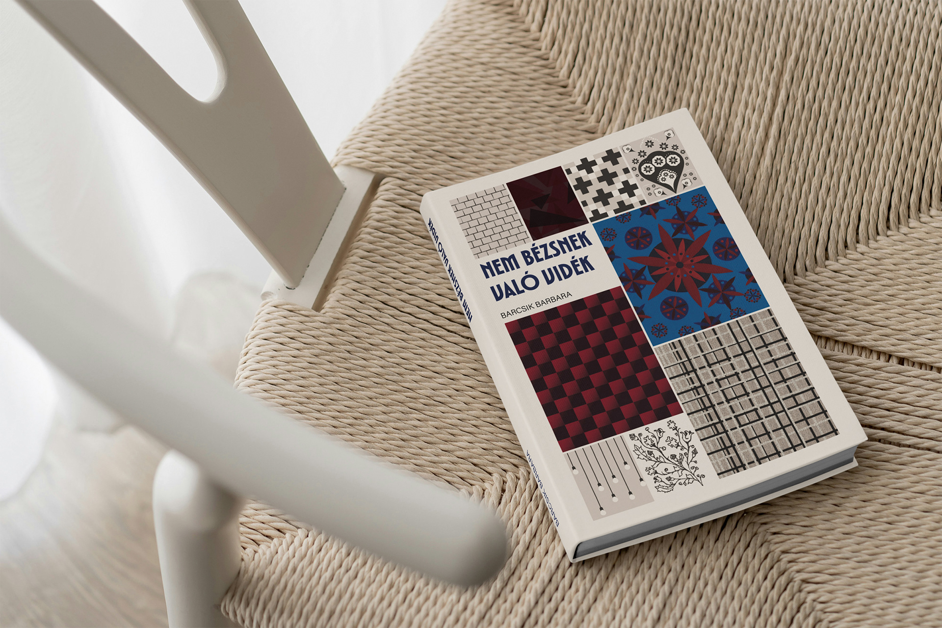
Concept: Showing the artistic styles that appears in interior design through patterns. My first thought was to showcase all the styles on the cover in a grid system, but it might be overwhelming all together. So I think, showing the styles, through pattern design, but in the same colours throughout the cover in the grid system, but using some accent colours to highlight some of the styles might work.
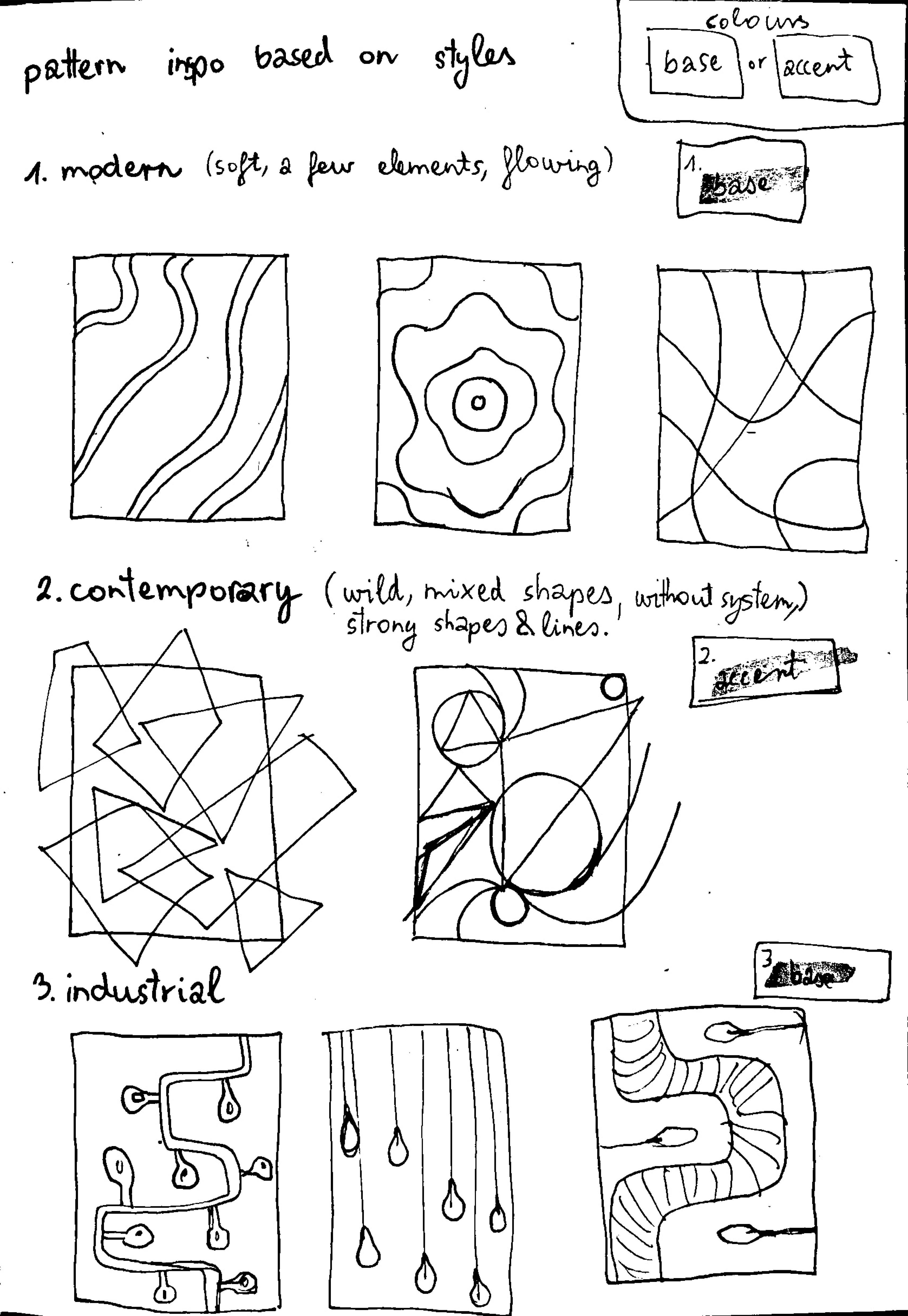
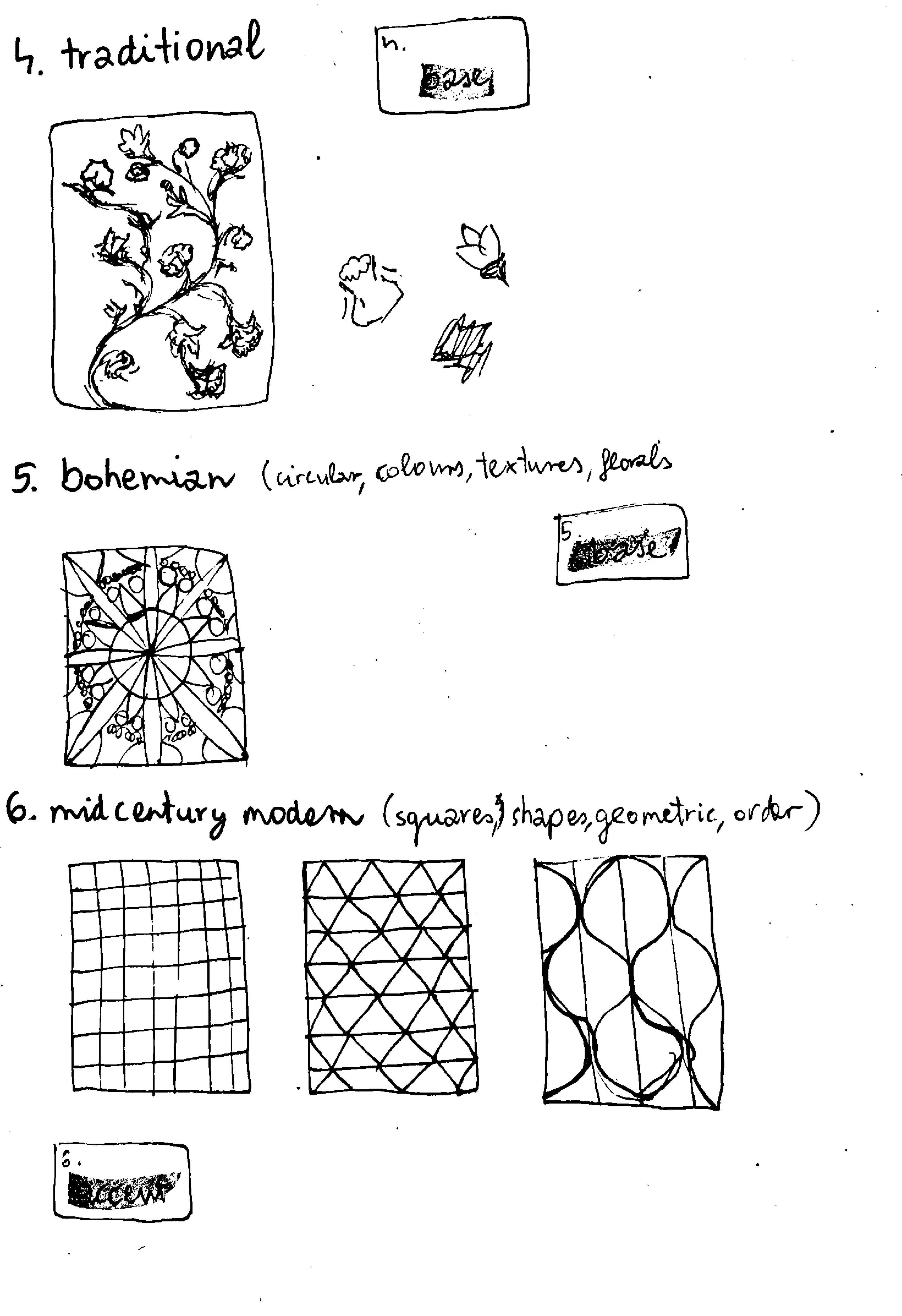
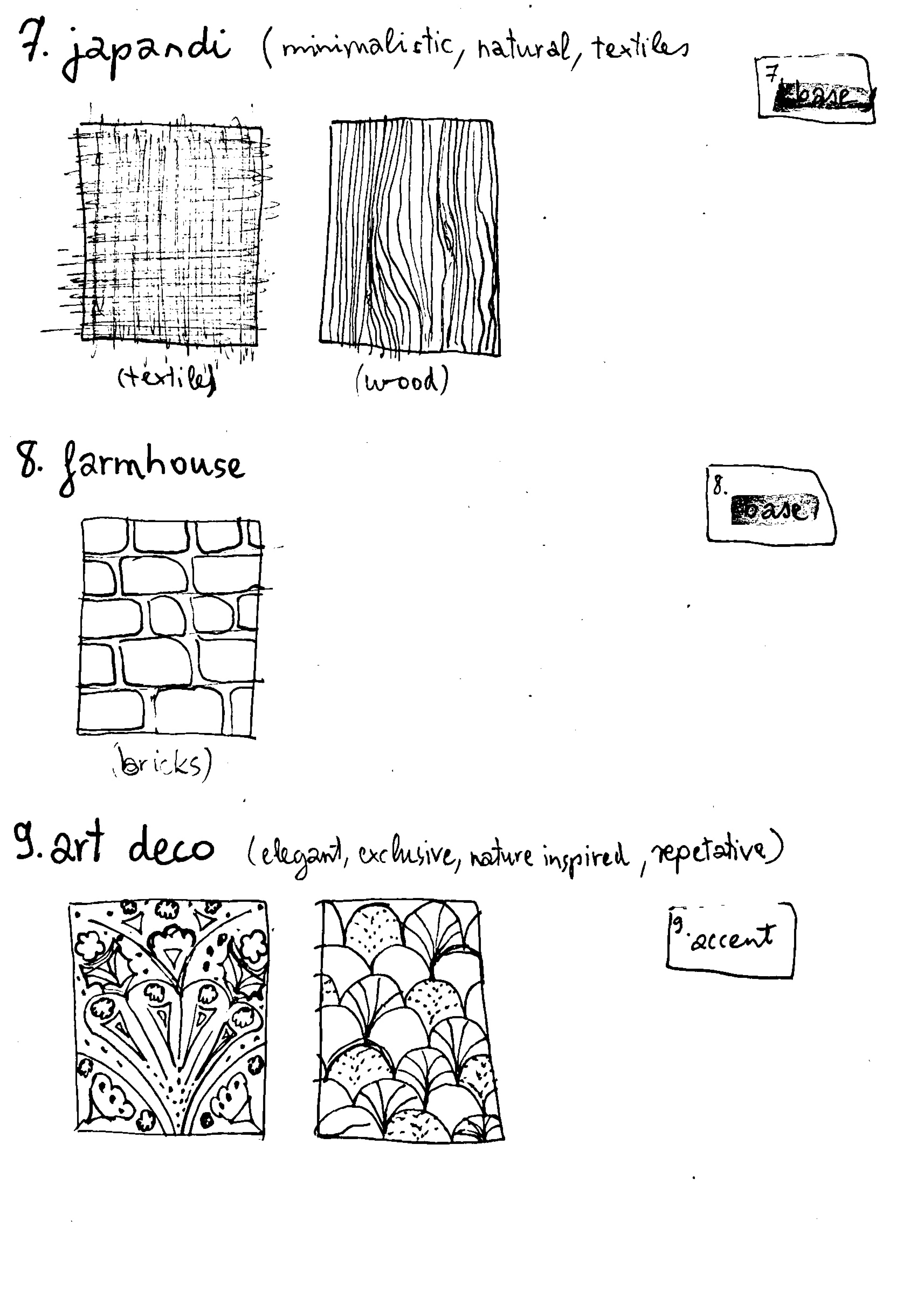


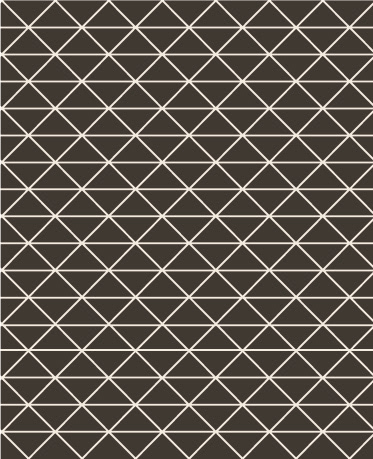


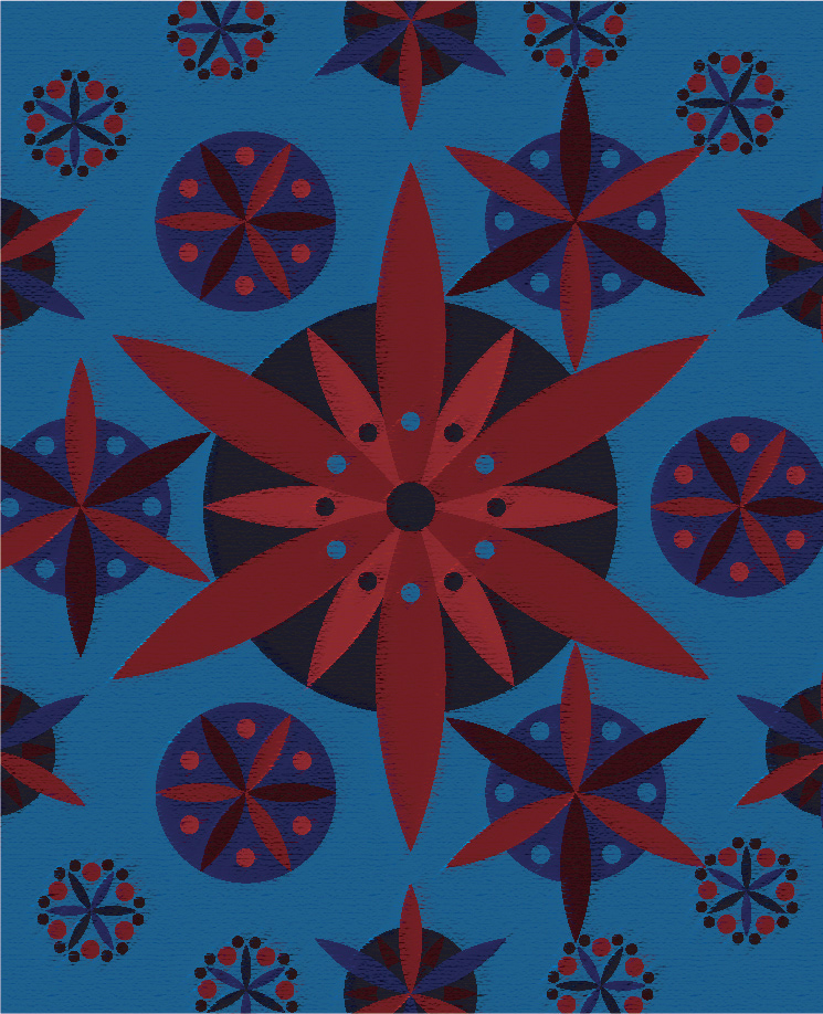
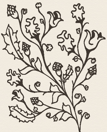
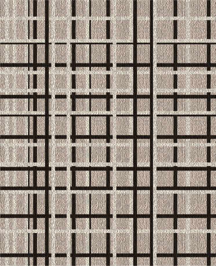
Colour palette: A natural soft colour for the base with a 3-5 secondary colours to create the patterns. Furthermore, the use of powerful, dark, and elegant colours such as red, purple, blue, or green helps to highlight and emphasise different styles against a beige, natural-toned space.
2. A kevesebb több
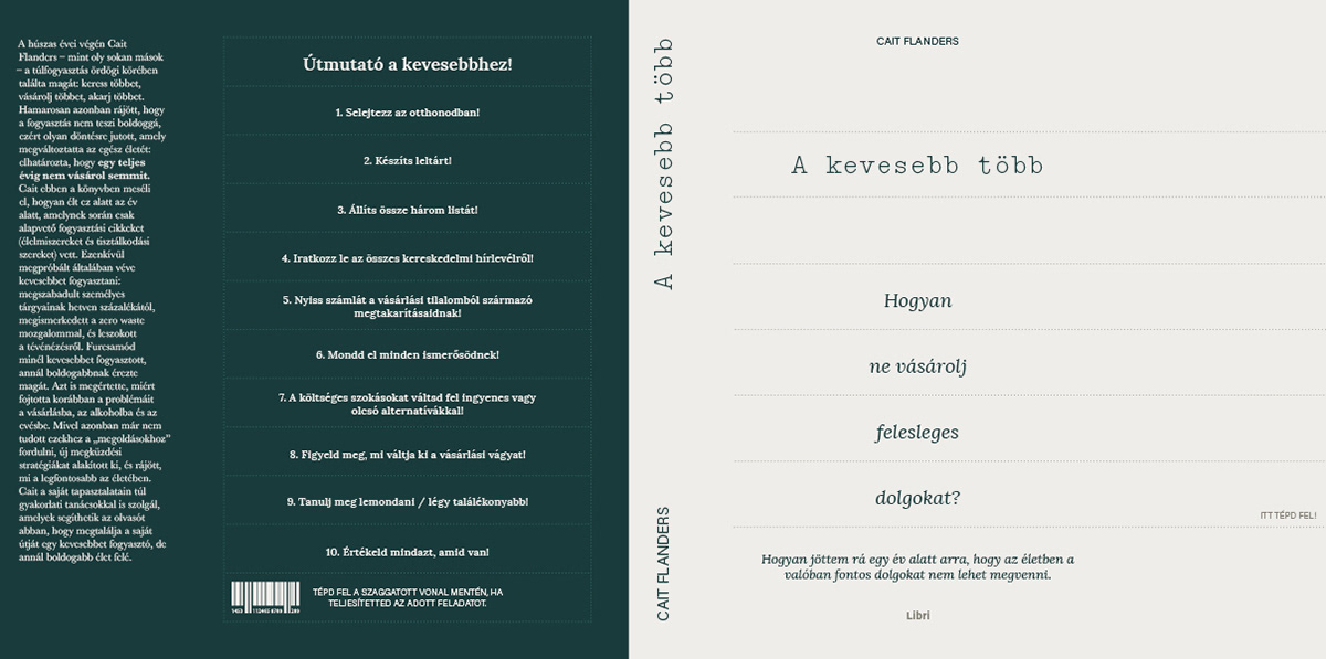
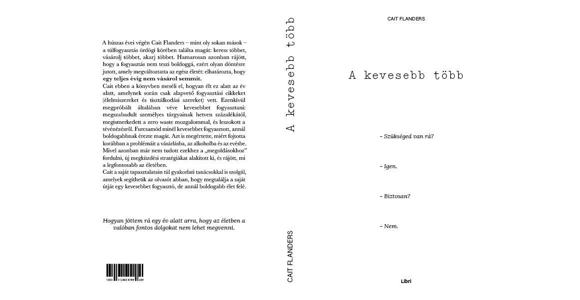
Concept: The goal was to create an interactive book cover that helps you to guide your life with the help of it. On the back cover you can strip out the parts which you are already done with, it helps you to track your to-dos.
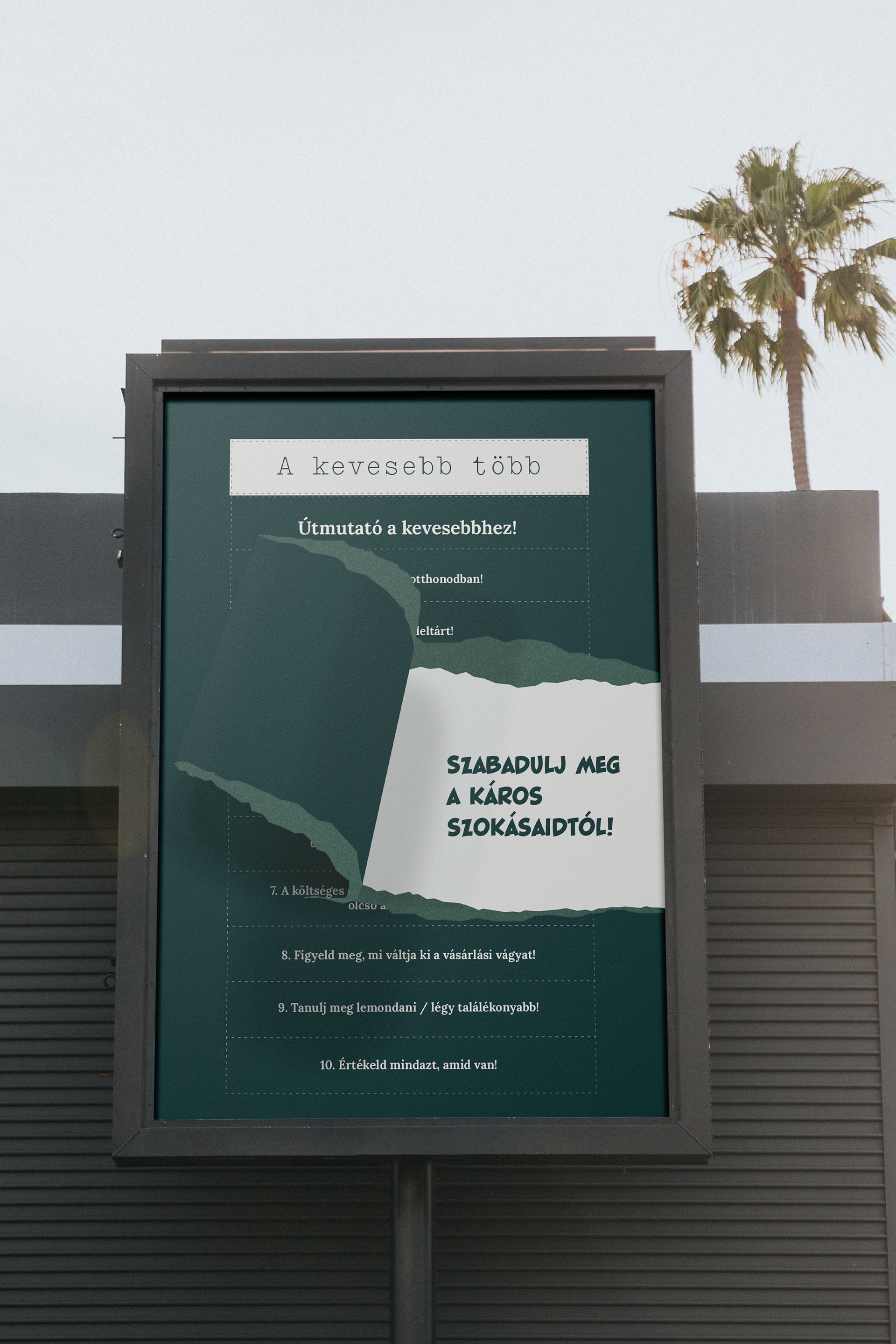
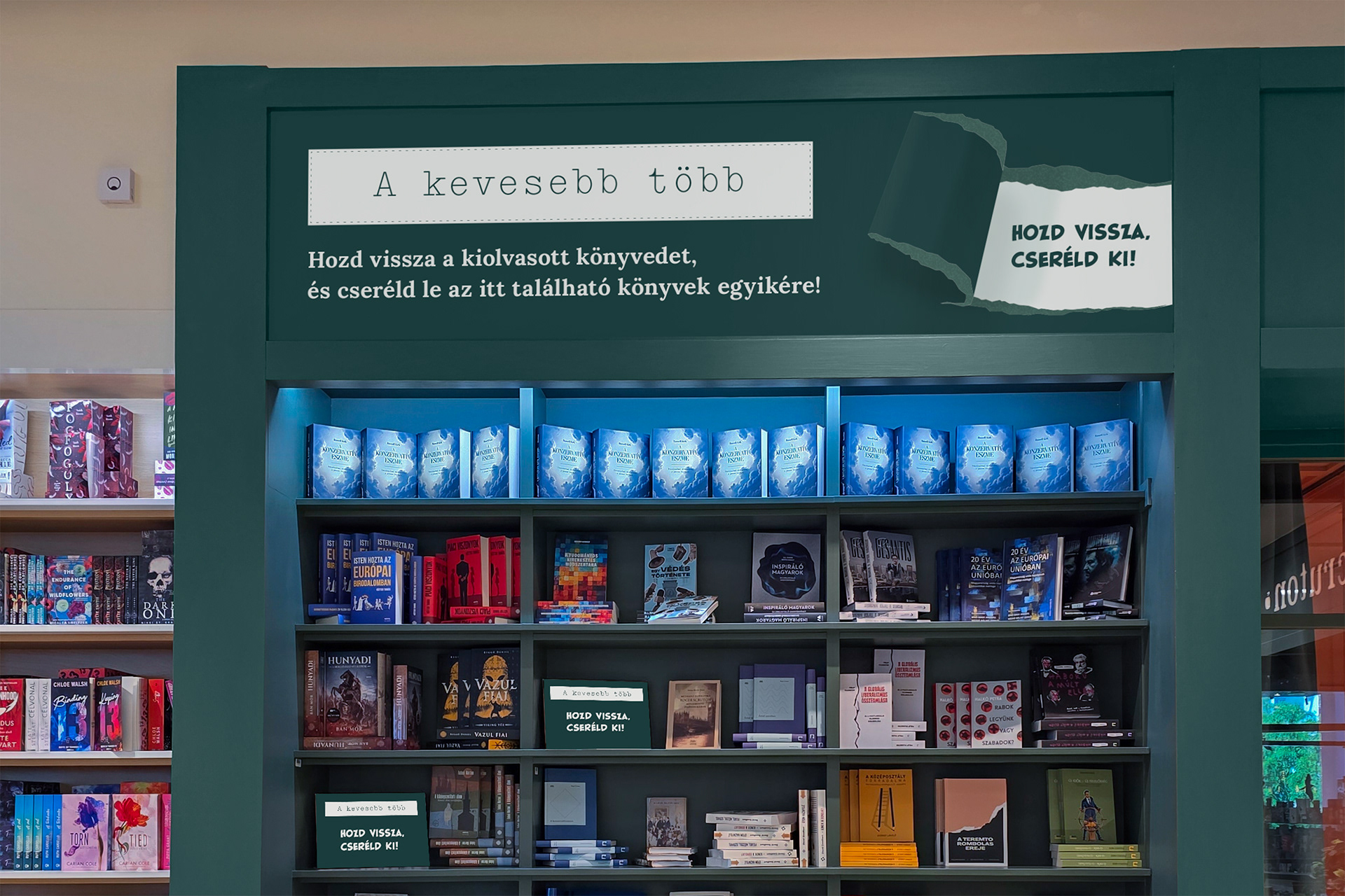
The poster and the in store design suggests the removing effect as well, to do not be afraid of releasing your toxic habits. It comes with an event where you can bring back and exchange the book for another one within the same price category from the highlighted shelves.
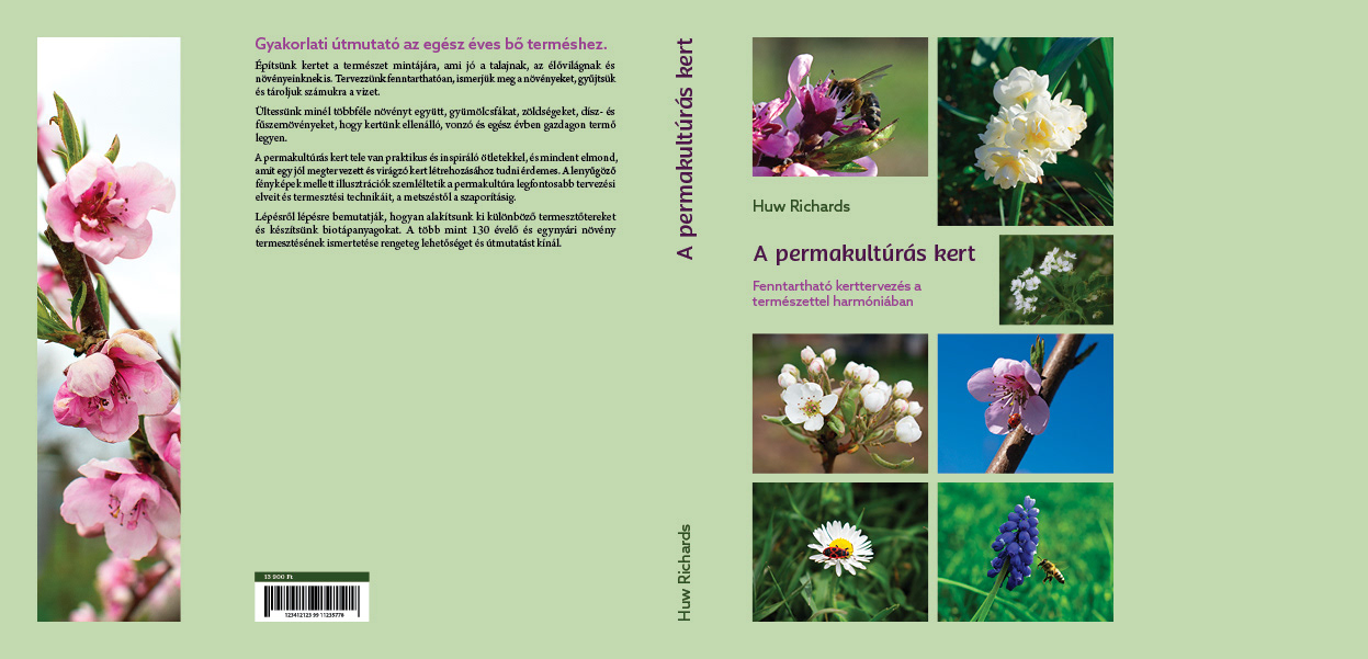
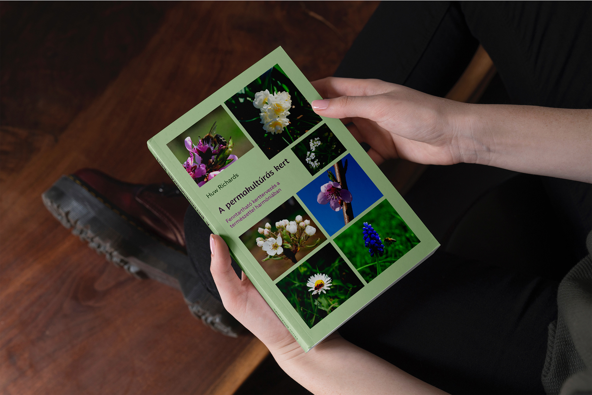
3. A permakultúrás kert

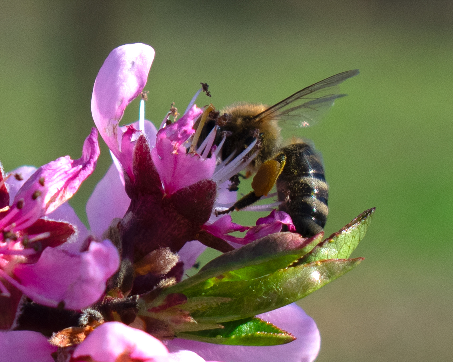
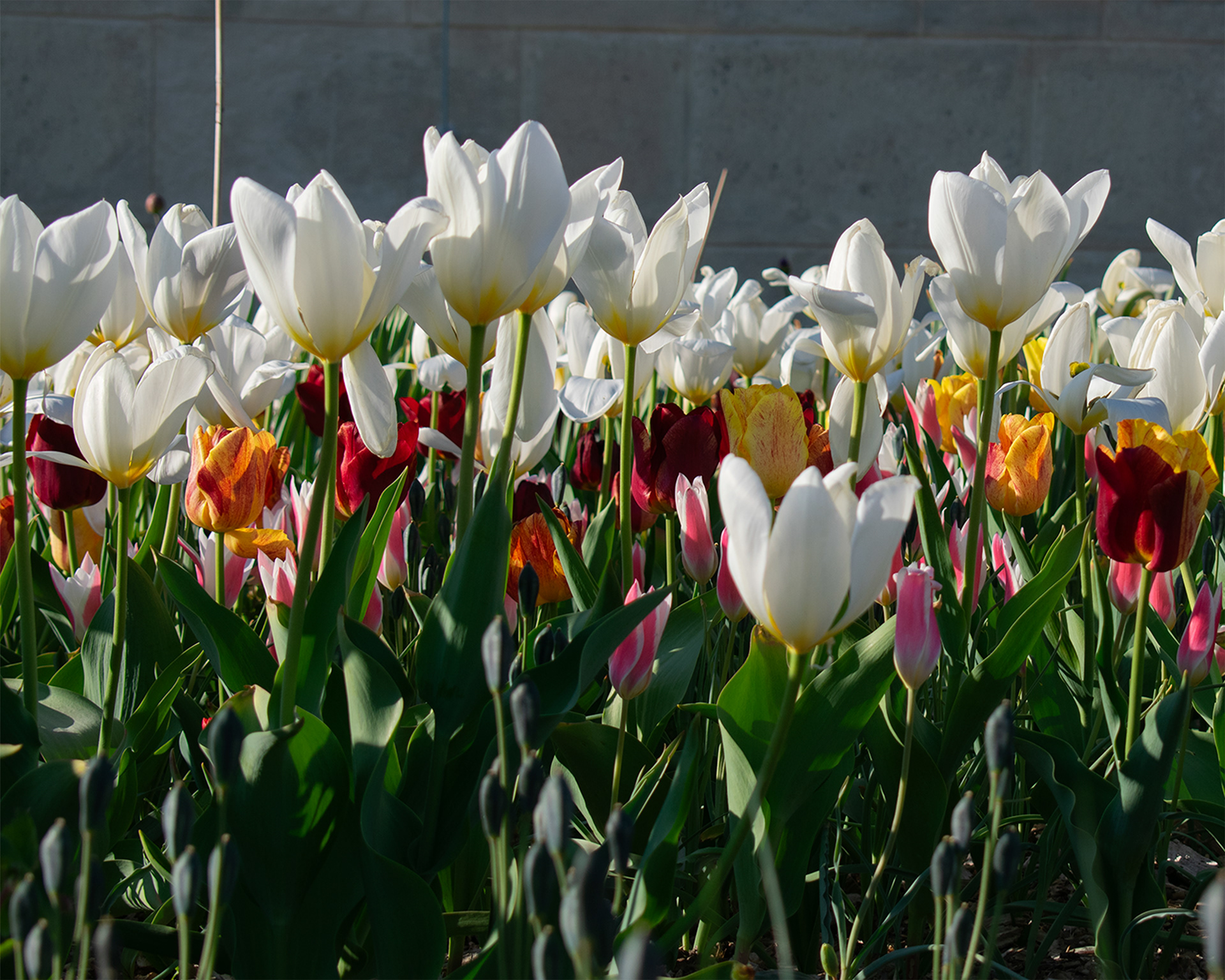

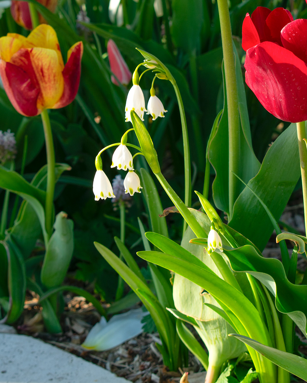
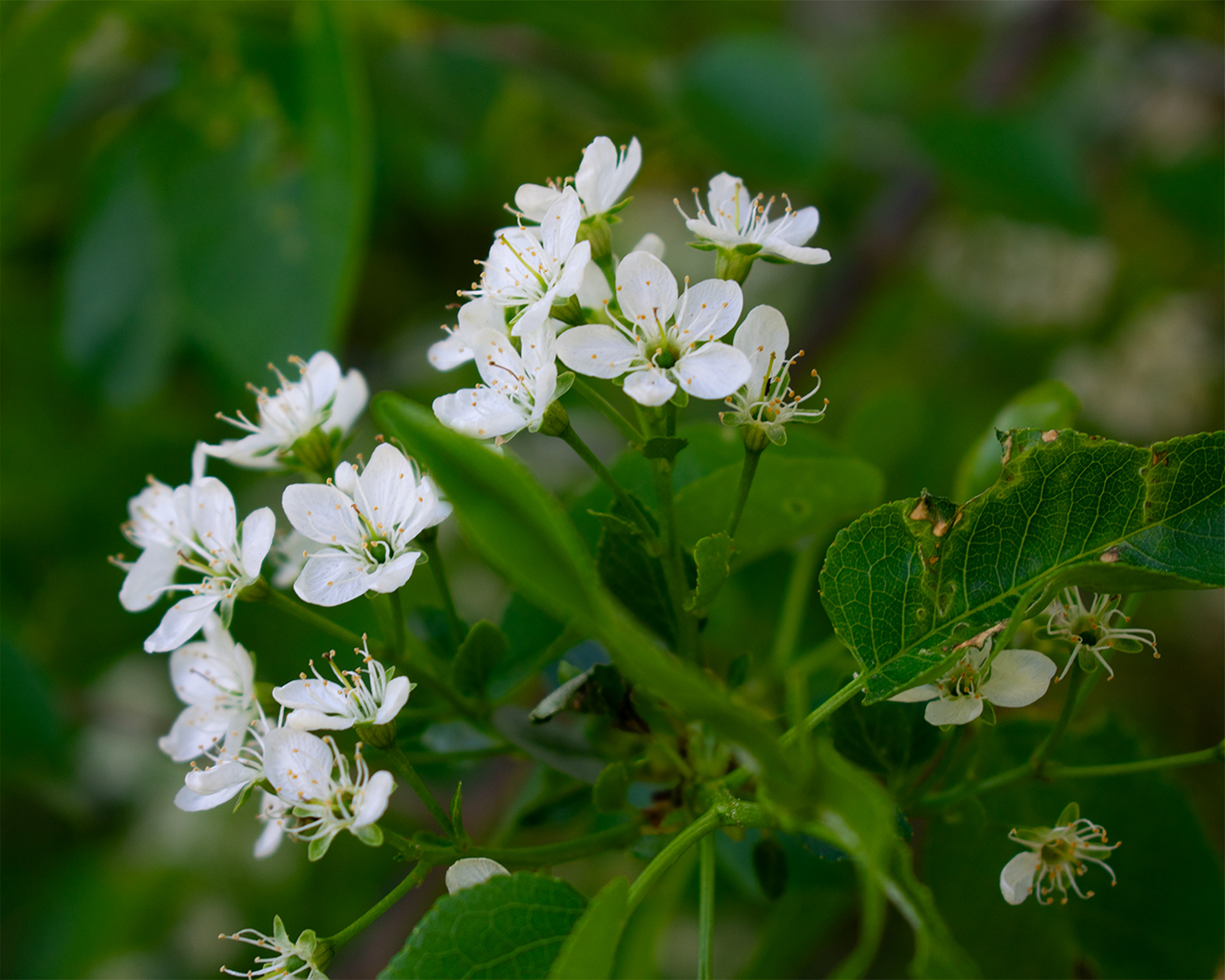
Photos: © All rights reserved: Panna Ingula